Showing posts with label typography. Show all posts

1.09.2012

Handmade modular type


These are my new house numbers, made out of 2 inch square scraps of different kinds of wood. I came up with the modular design based on squares and quarter circles.


I used the same modules for these thank you cards, using exacto-carved carrot stamps (kind of like potato prints).

1.05.2012

Happy 2012


I did a new snowflake for 2012 to accompany the ones from 2011 and 2010. These are not proper six-sided snowflakes; maybe I should be reported to the Campaign for Real Snowflakes?

11.29.2011

Emigre magazine remembered


I recently shared my collection of old Emigre magazines with some design students. Emigre was quite influential to me in the late 1980s and 90s. It was an early proponent of using the Macintosh as a design tool and pioneered digital typeface design, as well as showcasing experimental design. Later it published ideas about the ethical issues in design, including this article that affected my career. The entire collection of their magazines are in the permanent collection at the Museum of Modern Art.

Miriam's Garden Coaching card


I hand-lettered this business card design for Miriam Bock's garden coaching and design business. It's printed on a nice iridescent paper.

6.06.2011

Geez 22, the contemplation issue


This is the first cover of Geez that I have illustrated; hard to believe, since I've done plenty of artwork for the inside pages over the years. Anyway, I really like how this turned out. Click any image to enlarge.


I did a whole bunch of little line art spot illustrations for the inside as well, mostly portraits.


I also used a decorative typeface called Restraint, designed by Marian Bantjes; Restraint has lots of beautiful connecting design elements, and is both fun and frustrating to use.

2.09.2011

Caution tape headlines in Geez


For the upcoming security/police-themed issue of Geez magazine, I wanted to do some section headlines as though they were on police caution tape. I couldn't figure out how to get that look, then Laura gave me some glossy yellow tape that fit the bill. So I photographed it in various positions and added text to it in Photoshop. It would've looked even better if Geez was printed in color.

11.21.2010

Typographic oddities in Scotland


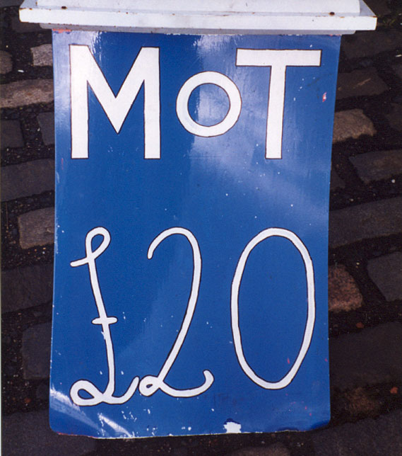
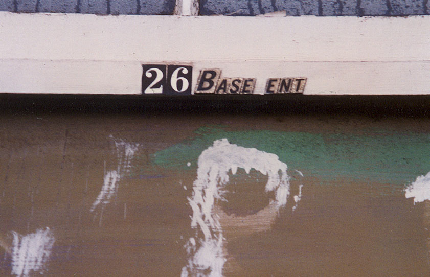
Photos of signs I took years ago in Scotland and England. Lots of interesting typography and handlettering there. The one of the old cigarette machine appears to read "ever open kids" but actually reads "ever open kiosk."

5.30.2010

Dust to dust


I saw this sign at the cemetery; it's in a glass case and is deteriorating in an interesting way, with fallen bits collecting in the bottom of the case.

5.17.2010

George Fox signage quiz


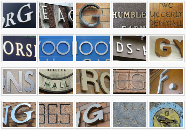
I made this quiz to see if my coworkers at George Fox University could identify where these signs appeared on our campus. The winner got 17 out of 20.

3.28.2010

Sticky love


This is a postage stamp I designed and submitted to the U.S. Postal Service recently. I noticed that a heart could be substituted for any of the letters in "love" and decided to design a stamp around that idea.

3.10.2010

Team Molldrew wedding invitation


Wedding invitation and save-the-date card I designed for some friends who wanted a circus/carnival theme for their wedding. My favorite part is the way the invitation folds. This job was a perfect excuse to purchase the typeface Great Circus, designed by Eduardo Recife.

2.08.2010

Geez logo exploration

For the newest issue of Geez magazine, I designed some modified logos for the cover. Previous issues have had a rough woodtype logo based on a bold Egyptian expanded font I scanned from an old type catalog. The angular version above was somewhat influenced by the typeface Meran, which we are using in the new issue.

This second version retains the wideness of the original, and is an attempt at an expanded blackletter type, with a swash at the end of the z.


We ended up with a cleaned-up version of the original that I redrew, shown above. I'm guessing we will occasionally do physical versions of it like we've done before, here and here.

8.29.2009

Geez 15 section dividers


For the start of each new section in Geez 15, I created some custom lettering by scanning a plastic lettering template (visible in the middle picture).