6.30.2008
Tin full o’ stamps
My dad collected stamps as a kid, and would tie up extras in little bundles with thread. I have this old tin full of the bundled stamps.
6.27.2008
Monster illustrations
Saturday sketchbook: Elvis stamp
6.22.2008
Geez issue 7
Geez issue 7 is the monster issue. The wraparound cover painting is by
Mark Bryan, who does smart, satirical art.
Below is a spread from the magazine featuring an underwater photo of me in Lost Lake, in case you were wondering what I look like. My friend Caitlin Keyzer took the picture.
Ugly Feelings poster
A poster I illustrated and designed for Ugly Feelings, a "fun evening of ideas, anecdotes, film and music that explore ugly feelings".
The name of the event came from this book.
6.21.2008
Diary boxes
6.20.2008
6.15.2008
Let’s go for a bike ride
These photos appeared in Geez 6. Concept: Aiden Enns; model and photo assistance: Tamara Vaags; photography and some art direction: me.
This reminds me of Bill Bryson writing about people who would drive a mile or two to the gym to walk a couple miles on the treadmill.
6.14.2008
Geez issue 6
Geez 6, the Awe and Wonder issue. Cover photo of a rooster by João Estêvão A. de Freitas.
I added a bit of gritty sparkly wonder (middle) to some of the headlines scattered throughout this issue.
Geez 6 also featured this piece (bottom) by Eduardo Recife, artist, illustrator and type designer extraordinaire.
6.10.2008
Living Stone Outreach
A logo I designed for Living Stone Outreach, a nonprofit group to assist people in meeting their basic needs for food, clothing, shelter and education. The initial logo (bottom) was developed because Living Stone is currently focused in Africa, but due to plans to expand beyond that continent, the less geographically-specific solution (top) was created.
6.08.2008
Baseball II
I drew on another old baseball. Not sure which one is more successful. I did each panel with a different, more detailed pattern on this one.
6.07.2008
Geez spines
We put a short quote on the spine of each Geez magazine, just a little bonus for anyone paying attention. And I add some color so they look nice all together on the shelf. My favorite spine line so far is “maybe there is something more important than being right” from the evangelical issue.
The unsuspecting nihilist
Illustrations I did for Books and Culture magazine for an article entitled Nietzsche was Right, about our disappearing moral foundations. Full image above, detail middle, secondary spot illustration for the same article bottom.
6.06.2008
Blind zippers
6.04.2008
Peace poster
6.03.2008
Living Room Theaters
Logo and grand opening invitation for Living Room Theaters in Portland, a high-end theater where you can watch foreign and independent films while enjoying a glass of wine and some tapas. I designed this while at
Staccato Design.
6.02.2008
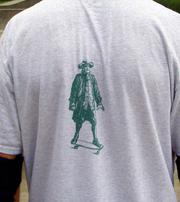
Quaker Skate
A goofy shirt I designed for my friends and me; we all attend North Valley Friends, a local Quaker church, and all skateboard, at least occasionally.
Subscribe to:
Posts (Atom)